About Spot on
Spot On, an iOS and Android app powered by Planned Parenthood’s experts, provides a medically accurate timeline and guides for any period havers who track their cycles. It is the only app on the market that provides over six birth control methods to select from and over 180 brands represented that you can sync the app to. Since its launch in 2016, Spot On has had over 2.6M downloads, and close to 68K monthly engaged users who log on and track their period, mood, activity and/or birth control.
Project goal
We aimed to increase the total journal entries per week and MAUs by improving accessibility to record information and personalizing the logging experience.
Final design and deliverables

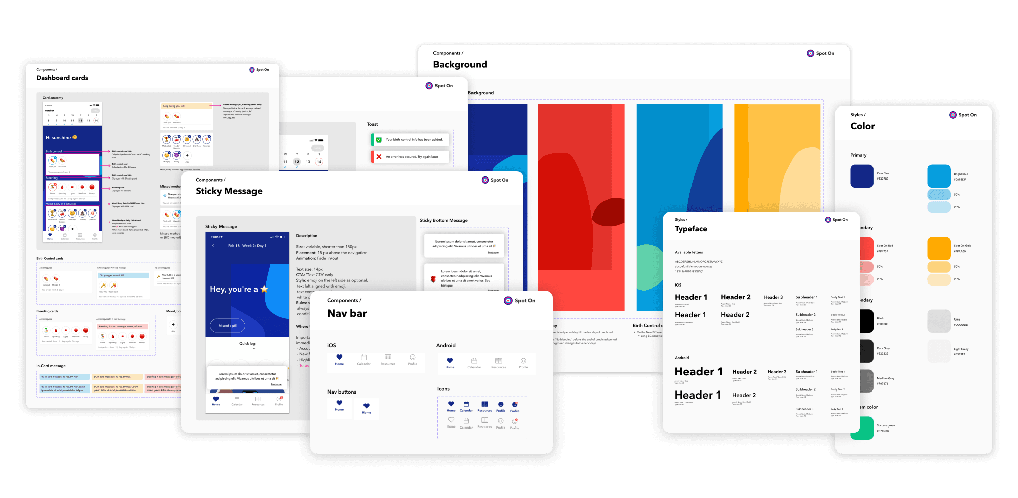
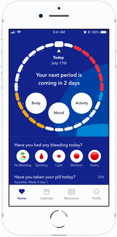
Based on the user feedback and research insights, we finalized the design for our new home screens and custom symptom flow. In short, we prioritize accessibility and usability overall.
We used cards and exposed the buttons to maximize usability of the app
We made the calendar scroll weekly incremental with a fixed header, with the names of days marked with only their first letters. No matter which way users scroll, they would alway see Sunday as the first one on the calendar, gaining a better sense of what day of a week they are on.
We added confirmation toast messages assuring users that their data was successfully saved. This was especially necessary for period and birth control logs, which do not open a new pop up that confirms saving the data while exiting it.
To make our dashboard message more informative yet keeping the joyful tone, we added an animation transition. Upon users opening the app, the fun greeting message showed up for 3 seconds and then quickly exited out. The upcoming period count down or any relevant messages of the day will then show up and stay.
I incorporated tooltips to indicate where users can find the new custom emoji feature. It would only display for the first time when users open the app after the feature is released.

Takeaways
To serve our organization’s mission to expand health equity focusing on historically under-resourced communities, we paid extra attention to diversity in research participants including their race, ethnicity and gender identity so that our users can help us design the product that is most useful to them.
In conjunction with their demographics, we also made sure to capture the various types of users so we removed bias: the old users who have been loving Spot On since pre-redesign, new users who had never seen the previous version of Spot On, users who only log their periods, and users who are on their Birth Control and record everything. It made us confident that we are building a useful product that helps all types of users.
Identifying problems to solve
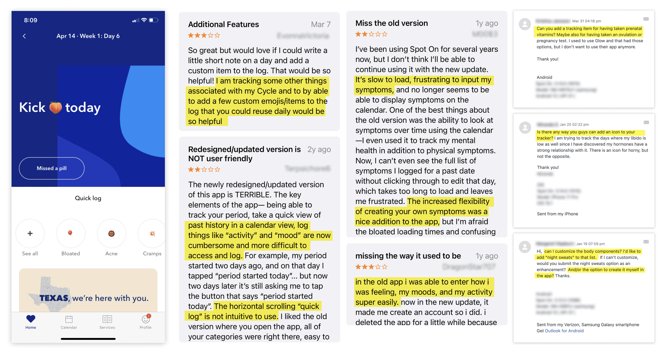

A screenshot of Amplitude: Tracking of the total Journal Entries per month compared to FY 21
Since the major app redesign in a couple years ago, we have been observing the decreasing number of MAU and journal entries. Throughout the in-app surveys, CX tickets and App store reviews, many users have expressed their frustrations with not being able to log quickly nor personalize their symptoms.
Our users
Majority of our users age between 18-24 (46%), closely followed by 25-34 (27%).
Race/Ethnicity is similarly reflective of the general US population, 44% BiPOC - 16% LatinX/Hispanic, 13% Black/African American, 4% APIA, 5% multiracial, 6% other (56% white). 57% of our MEUs are tracking their period cycle, while 43% track their birth control AND period. Of these personas, 33% of our MAUs also track how their body feels (e.g. having cramps, feeling bloated, experiencing backache, tender breasts, acne breakouts and even headaches) and 20% track their mood (e.g. feeling emotional, stressed, happy, anxious, and/or annoyed)
Survey and workshops

Internal team ideation
We brought CX, QA, FE, BE developers and Product manager into the (virtual) room to ideate and discuss their vision for our new Home screen. I shared preliminary research and feedback from the app store and play store reviews and CX tickets. The team sketch the possible features for the home screen. This was a great exercise to understand the technical implications of the potential features. We consolidated overlapping ideas and voted on the big ideas.
From the exercise, the most popular changes for the home screen were:
Cycle visualization using a circle graphic
Logging with a fixed quick log button on nav
Replace Quick Log with Categories
Weekly calendar view

Survey & Co-design session
A total of 38 participants responded to the survey. There were four types of respondents:
1) users who have used Spot On for over two years; 2) new users; 3) users only tracking period; 4) users only tracking birth control and period.
In this survey, we asked
the most/ least useful feature on current Spot On Home screen
how the users’ goals impact their most/least useful features
what features (information) users want to see on Home screen
Then we held a Google Jam board session with 3 users from the survey participants. To help users better address their ideas, we added a tutorial and sticker sheets to encourage the users to express their ideas.
Design explorations

New Home screen Concept testings

Based on the learnings, I created a few different concept sketches for the Home screen and developed 2 distinct wireframes. After gathering feedback from team members including designers, developers and the product manager, I conducted a quick concept comparison test to understand our users’ preference.
Post MVP
Unfortunately, due to the unexpected tech debts that were off the radar, the development of these epics were delayed. I’d love to observe the impact of the improvements so we can plan our v2 improvements. Meanwhile I continued writing tickets and prioritizing tasks.
I suggested following for the post MVP:
We should closely monitor how users are engaged with the weekly calendar in relation to the full calendar screen. Eventually I’d love to see if we could integrate the full calendar page inside the weekly calendar by making it expandable. This consolidation will allow users to quickly navigate between different months from the Home page and free up the space on the Nav bar menu for the Pattern view (next Epic).
We should consider moving the articles on the Homepage to the Resource page as the majority of users did not engage with the articles and thought they were ads. This will also give us an opportunity to re-design the Resource pages to give a better hierarchy and make the information more searchable
We should track how period and birth control logs perform. We expect to see at least 15% surge of logging during the period and when new birth control events occur. We can adjust the design of in-card messages or come up with a different way to emphasize the logging activities.
To allow users to mark their favorite Body, Mood and Activities items so they can access it even faster
To monitor users’ logging patterns, especially the # of logging during the period or on the birth control renewal dates so we may adjust the in-card message design
About Spot on
Spot On, an iOS and Android app powered by Planned Parenthood’s experts, provides a medically accurate timeline and guides for any period havers who track their cycles. It is the only app on the market that provides over six birth control methods to select from and over 180 brands represented that you can sync the app to. Since its launch in 2016, Spot On has had over 2.6M downloads, and close to 68K monthly engaged users who log on and track their period, mood, activity and/or birth control.
Project goal
We aimed to increase the total journal entries per week and MAUs by improving accessibility to record information and personalizing the logging experience.
Final design and deliverables
Based on the user feedback and research insights, we finalized the design for our new home screens and custom symptom flow. In short, we prioritize accessibility and usability overall.
We used cards and exposed the buttons to maximize usability of the app
We made the calendar scroll weekly incremental with a fixed header, with the names of days marked with only their first letters. No matter which way users scroll, they would alway see Sunday as the first one on the calendar, gaining a better sense of what day of a week they are on.
We added confirmation toast messages assuring users that their data was successfully saved. This was especially necessary for period and birth control logs, which do not open a new pop up that confirms saving the data while exiting it.
To make our dashboard message more informative yet keeping the joyful tone, we added an animation transition. Upon users opening the app, the fun greeting message showed up for 3 seconds and then quickly exited out. The upcoming period count down or any relevant messages of the day will then show up and stay.
I incorporated tooltips to indicate where users can find the new custom emoji feature. It would only display for the first time when users open the app after the feature is released.
Takeaways
To serve our organization’s mission to expand health equity focusing on historically under-resourced communities, we paid extra attention to diversity in research participants including their race, ethnicity and gender identity so that our users can help us design the product that is most useful to them.
In conjunction with their demographics, we also made sure to capture the various types of users so we removed bias: the old users who have been loving Spot On since pre-redesign, new users who had never seen the previous version of Spot On, users who only log their periods, and users who are on their Birth Control and record everything. It made us confident that we are building a useful product that helps all types of users.
Identifying problems to solve
A screenshot of Amplitude: Tracking of the total Journal Entries per month compared to FY 21
Since the major app redesign in a couple years ago, we have been observing the decreasing number of MAU and journal entries. Throughout the in-app surveys, CX tickets and App store reviews, many users have expressed their frustrations with not being able to log quickly nor personalize their symptoms.
Our users
Majority of our users age between 18-24 (46%), closely followed by 25-34 (27%).
Race/Ethnicity is similarly reflective of the general US population, 44% BiPOC - 16% LatinX/Hispanic, 13% Black/African American, 4% APIA, 5% multiracial, 6% other (56% white). 57% of our MEUs are tracking their period cycle, while 43% track their birth control AND period. Of these personas, 33% of our MAUs also track how their body feels (e.g. having cramps, feeling bloated, experiencing backache, tender breasts, acne breakouts and even headaches) and 20% track their mood (e.g. feeling emotional, stressed, happy, anxious, and/or annoyed)
Survey and workshops
Internal team ideation
We brought CX, QA, FE, BE developers and Product manager into the (virtual) room to ideate and discuss their vision for our new Home screen. I shared preliminary research and feedback from the app store and play store reviews and CX tickets. The team sketch the possible features for the home screen. This was a great exercise to understand the technical implications of the potential features. We consolidated overlapping ideas and voted on the big ideas.
From the exercise, the most popular changes for the home screen were:
Cycle visualization using a circle graphic
Logging with a fixed quick log button on nav
Replace Quick Log with Categories
Weekly calendar view
Survey & Co-design session
A total of 38 participants responded to the survey. There were four types of respondents:
1) users who have used Spot On for over two years; 2) new users; 3) users only tracking period; 4) users only tracking birth control and period.
In this survey, we asked
the most/ least useful feature on current Spot On Home screen
how the users’ goals impact their most/least useful features
what features (information) users want to see on Home screen
Then we held a Google Jam board session with 3 users from the survey participants. To help users better address their ideas, we added a tutorial and sticker sheets to encourage the users to express their ideas.
Design explorations
New Home screen Concept testings
Based on the learnings, I created a few different concept sketches for the Home screen and developed 2 distinct wireframes. After gathering feedback from team members including designers, developers and the product manager, I conducted a quick concept comparison test to understand our users’ preference.
Post MVP
Unfortunately, due to the unexpected tech debts that were off the radar, the development of these epics were delayed. I’d love to observe the impact of the improvements so we can plan our v2 improvements. Meanwhile I continued writing tickets and prioritizing tasks.
I suggested following for the post MVP:
We should closely monitor how users are engaged with the weekly calendar in relation to the full calendar screen. Eventually I’d love to see if we could integrate the full calendar page inside the weekly calendar by making it expandable. This consolidation will allow users to quickly navigate between different months from the Home page and free up the space on the Nav bar menu for the Pattern view (next Epic).
We should consider moving the articles on the Homepage to the Resource page as the majority of users did not engage with the articles and thought they were ads. This will also give us an opportunity to re-design the Resource pages to give a better hierarchy and make the information more searchable
We should track how period and birth control logs perform. We expect to see at least 15% surge of logging during the period and when new birth control events occur. We can adjust the design of in-card messages or come up with a different way to emphasize the logging activities.
To allow users to mark their favorite Body, Mood and Activities items so they can access it even faster
To monitor users’ logging patterns, especially the # of logging during the period or on the birth control renewal dates so we may adjust the in-card message design